
728x90
반응형
이번에 진행하는 토이 프로젝트인 하루네컷의 목표 중에 하나가 바로 Core Component를 먼저 만들어두고
Screen에서 이를 가져와 조립하는 방법으로 UI를 구성하는 것이었습니다. 🤗
해당 포스트에서는 만들어본 Component들과 이와 관련된 코드들을 정리해보고자 합니다.
🌹 이후에 또 비슷한 Component를 사용할 저를 위해ㅎㅎ
Core Component를 만들기 전에 먼저 기획 문서를 작성하고 시작해 보았어요. 🔥👍🏻
만약 실무에서 동일한 업무를 수행한다면 다른 프레임워크 개발자분들과 소통을 하는데
문서가 가장 좋다고 생각해서 연습(?)을 해보았습니다.ㅎㅎ
👇🏻 요렇게!

[BASE] #8 Core Component 추가하기 by aurora32s · Pull Request #10 · aurora32s/1D4P
📌 내용 designsystem 기획에 맞게 core compnent와 preview 추가 🛠 Done Surface Image ImageList Button Calendar Chip TextField 🪴결과 UI 1. Surface 2. Image & 3. ImageList 4. Button 5. Calendar 6. Chip...
github.com
1. Surface
Shadow는 Canvas로 직접 구현
@Composable
fun HarooSurface(
    modifier: Modifier = Modifier,
    shape: Shape = MaterialTheme.shapes.medium, // 모양
    color: Color = HarooTheme.colors.uiBackground, // 배경색
    contentColor: Color = HarooTheme.colors.text, // 내용 색
    border: BorderStroke? = null, // 테두리 모양
    elevation: Dp = 0.dp, // 그림자 크기
    alpha: Float = 0.15f, // 배경 투명도
    content: @Composable () -> Unit
)
2. Image와 Image List
Image List는 Custom Layout으로 직접 구현

2.1 Image List
@Composable
fun HarooImageList(
    modifier: Modifier = Modifier,
    images: List<Image>, // 이미지 정보 리스트
    padding: Dp = 0.dp // 이미지 사이 넓이
)
2.2 Image
@Composable
fun HarooImage(
    modifier: Modifier = Modifier,
    onClick: () -> Unit = {},
    shape: Shape = MaterialTheme.shapes.medium, // 이미지 모양
    elevation: Dp = 2.dp, // 그림자 크기
    imageType: Image // 이미지 정보
)
3. Button
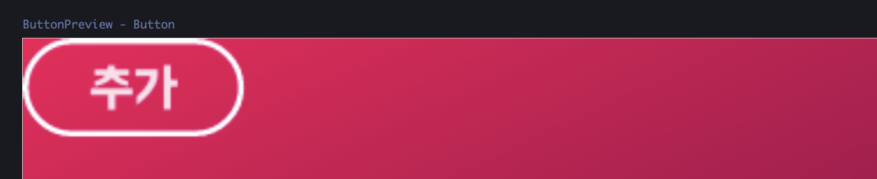
@Composable
fun HarooButton(
    modifier: Modifier = Modifier,
    onClick: () -> Unit,
    enabled: Boolean = true, // 사용 가능 여부
    shape: Shape = MaterialTheme.shapes.small,
    border: BorderStroke? = null, // 테두리 모양
    alpha: Float = 1f, // 배경색 투명도
    backgroundColor: Color = Color.Unspecified, // 배경 색
    disableBackgroundColor: Color = Color.Unspecified, // disable 일때 배경 색
    contentColor: Color = HarooTheme.colors.text, // 내부 색
    // disable 일때 배경 색
    disableContentColor: Color = HarooTheme.colors.text.copy(alpha = 0.3f),
    // 내부 padding
    contentPadding: PaddingValues = ButtonDefaults.ContentPadding,
    content: @Composable RowScope.() -> Unit
)
4. Calendar
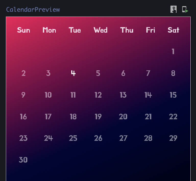
@Composable
fun Calendar(
    modifier: Modifier = Modifier,
    currentMonth: YearMonth, // 현재 year & month
    // 한주가 시작 하는 요일
    firstDayOfWeek: DayOfWeek = WeekFields.of(Locale.getDefault()).firstDayOfWeek,
    // 금일
    today: LocalDate = LocalDate.now(),
    // 이전, 다음 달의 요일도 component 에 표현 할지 여부
    showAdjacentMonths: Boolean = false,
    // 세로 라인 중간 space 넓이
    space: Dp = 0.dp,
    // 날짜 Component
    dayContent: @Composable BoxScope.(DayState) -> Unit,
    // 요일 component
    weekHeader: @Composable ColumnScope.(List<DayOfWeek>) -> Unit
)
5. Chip
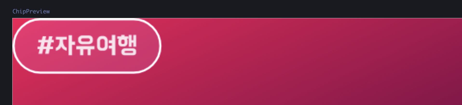
@Composable
fun HarooChip(
    modifier: Modifier = Modifier,
    onClick: () -> Unit = {},
    shape: Shape = MaterialTheme.shapes.small,
    backgroundColor: Color = HarooTheme.colors.uiBackground,
    // 테두리 색
    border: BorderStroke = BorderStroke(width = 1.dp, color = backgroundColor),
    contentColor: Color = HarooTheme.colors.text,
    content: @Composable RowScope.() -> Unit
)
6. TextField

@Composable
fun HarooTextField(
    modifier: Modifier = Modifier,
    enabled: Boolean = true, // 사용 가능 여부
    value: String, // 입력 값
    onValueChange: (String) -> Unit, // 입력값 변경
    shape: Shape = MaterialTheme.shapes.medium,
    color: Color = HarooTheme.colors.uiBackground, // 배경 색
    contentColor: Color = HarooTheme.colors.text, // 내부 색
    border: BorderStroke? = null, // 테두리 모양
    placeHolder: String = "", // hint
    singleLine: Boolean = true, // 한줄 여부
    maxLines: Int = Int.MAX_VALUE // 최대 입력 가능 라인
)
반응형
'기록 > 회고록' 카테고리의 다른 글
| [2024] 부터 시작하는 올해 뭘 했을까? 😆 (0) | 2024.11.08 |
|---|---|
| [Android] Github CI/CD를 이용해 Firebase App Distribution까지! (0) | 2023.04.02 |
| [Android] 첫 멀티모듈 적용기 (0) | 2023.03.06 |
| [우테캠] 2차 팀별 과제 회고록 (2) | 2022.07.22 |
| 처음 써보는 회고록👍🏻 가봤슈 프로젝트 (2) | 2022.06.30 |